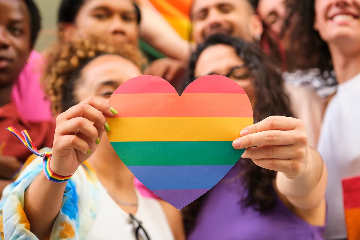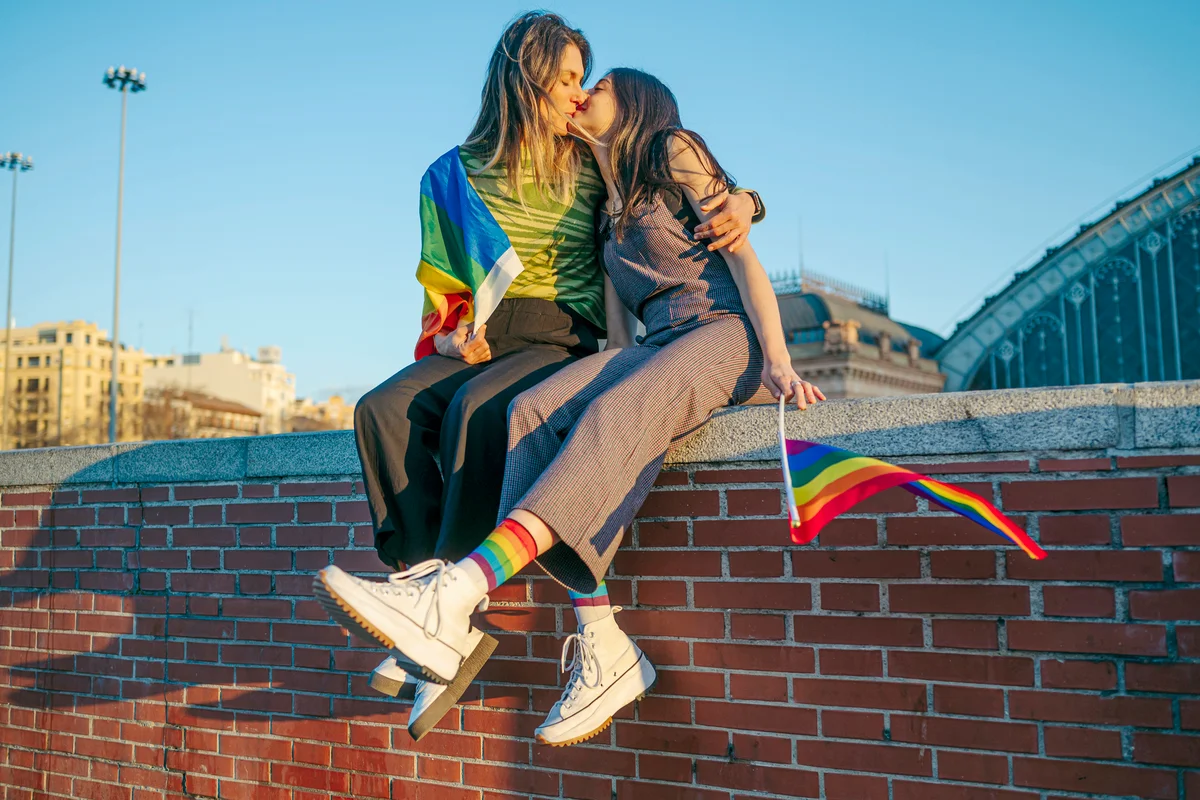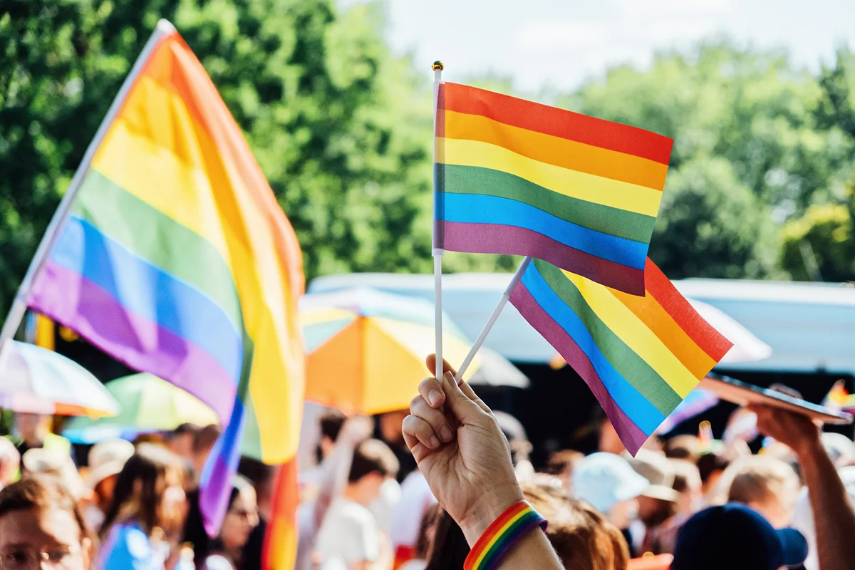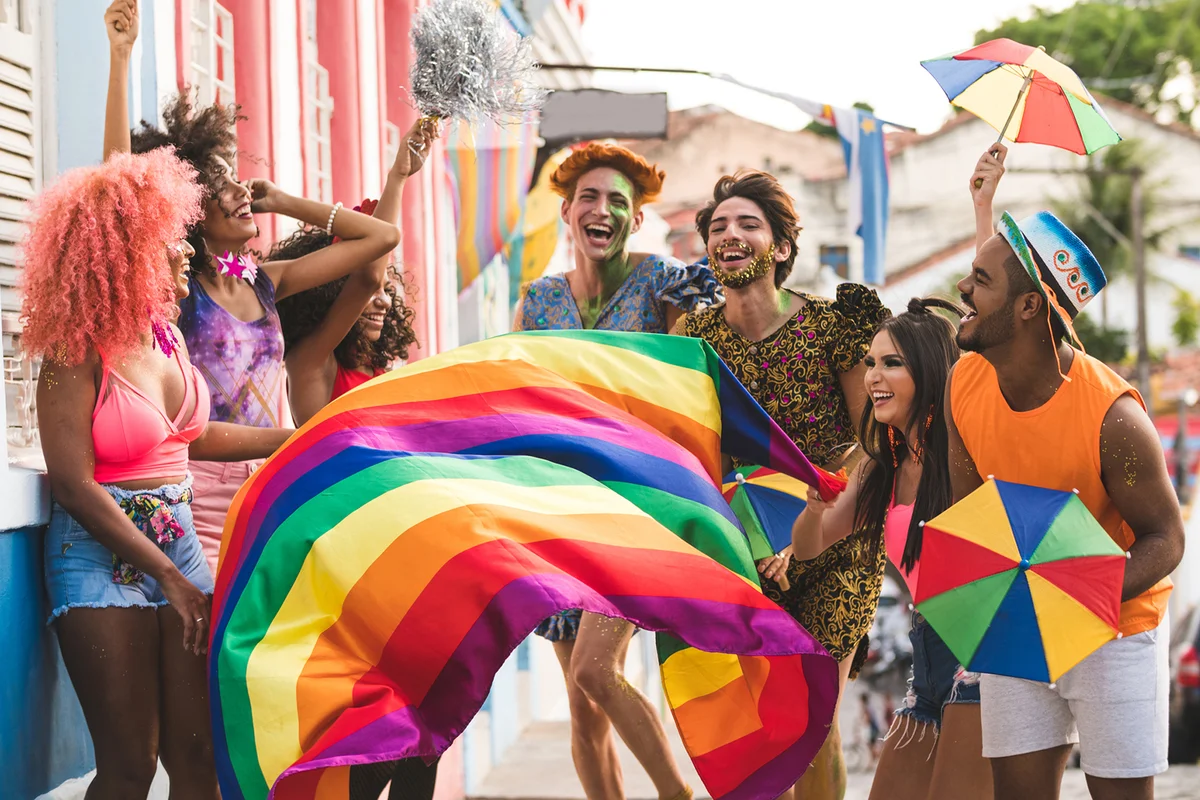
The pride flag and its rainbow of colors has been a calling card of safe spaces for people of all sexual and gender orientations for decades. Yet, the intention behind the LGBTQIA+ flag's design is often overshadowed by the corporate and capitalist co-opting of recent years. However, this powerful symbol that's evolved into not one, but a series of gender and sexuality specific flags, has a rich history and a specific meaning that speaks to the love and light of the community at large.
How the LGBTQIA+ Flag Was Born
Deeply rooted in the cultural upheaval of the 1970s, the LGBTQIA+ flag was created out of an artistic commission from San Francisco's City Supervisor Harvey Milk for Gilbert Baker, one of the chairs of the city's Decoration Committee. The commission was for a new symbol to represent the LGBTQIA+ community, and Baker's intention with his multi-colored flag was to create something that embodied their community's rich diversity.
What Do Each of the Colors Represent?
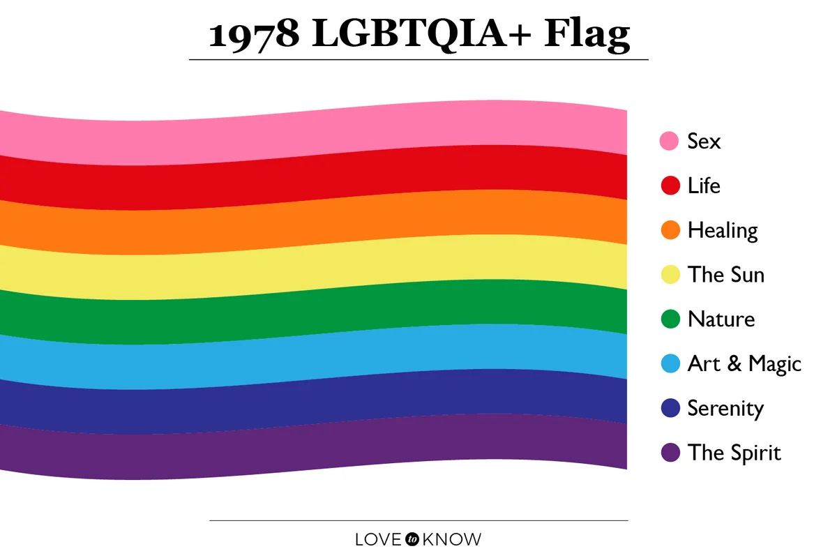
The flag that debuted at San Francisco's 1978 Gay Freedom Day Parade was an arrangement of eye-catching colors. However, this colorful display wasn't created for aesthetics alone, and Baker intended for each of the colors to represent something. Some of these meanings were concrete features of queer life, while others were more abstract, but together they captured the community's magic, tenacity, bravery, and creativity.
The eight colors featured on the original LGBTQIA+ flag were (in descending order): pink, red, orange, yellow, green, turquoise, blue, and purple. Each of these colors represented:
- Pink - Sex
- Red - Life
- Orange - Healing
- Yellow - The Sun
- Green - Nature
- Turquoise - Art and Magic
- Blue - Serenity
- Purple - The Spirit
Harvey Milk's Assassination and the LGBTQIA Flag's Evolution
Harvey Milk's assassination in late 1978 was a devastating blow to the LGBTQIA+ community. As an openly gay political figure, Milk stood as a perceived threat to middle America's nuclear family values, and the growing unrest of the Cold War. Discontent with an economic downturn, soaring gas prices, and international scandals only fed this insular mentality that had been weaponized in the most brutal of ways.
Not only did Milk's murder have a massive impact on the community at large, it also permeated the newly minted flag's design. As people sought to buy more and more of these flags, those producing it realized the pink fabric was difficult to obtain and an even number of stripes were the most practical. Thus, in 1979, a new six-color flag debuted featuring the red, orange, yellow, green, blue, and purple combination everyone's most familiar with today.
Community Flags Have Become Commonplace
In the following decades, multiple different LGBTQIA+ flags have been created and adopted by their respective communities. The first of these subsequent flags was the pink, purple, and blue one representing bisexuals that was made by Michael Page in 1998. What's followed is a number of flags in a spectrum of colors embodying identities like asexual, aromatic, lesbian, transgender, homosexual, and more.
As terminology is changing and identity definitions are being adapted to match new language and discourse, the flags are evolving as well. One of the central pieces of the queer community is being accepting of this evolution, and so for now, the most current version of the LGBTQIA+ flag combines aspects from multiple flags to be more inclusive of the individual people that comprise the broader queer community.
The Progress Flag
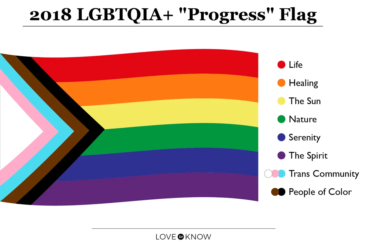
Designed by Daniel Quasar in 2018, this "Progress Flag" has triangular chevron additions to the original flag's designs, and these deliberate alterations add layers to the conversation. These colors and their meanings are:
- White, pink, and blue - Transgender Community
- Brown and black - Marginalized members of the LGBTQIA+ community
These colors are now included in an effort to acknowledge and support historically marginalized groups within the queer community whose voices have been overlooked and contributions unrecognized. In recent years, there's been a move to give trans women of color the public respect and acknowledgement that they deserve for the early contributions they made in the fight for social, economic, and political equality, and this flag reflects that development.
The Intersex Inclusion Campaign
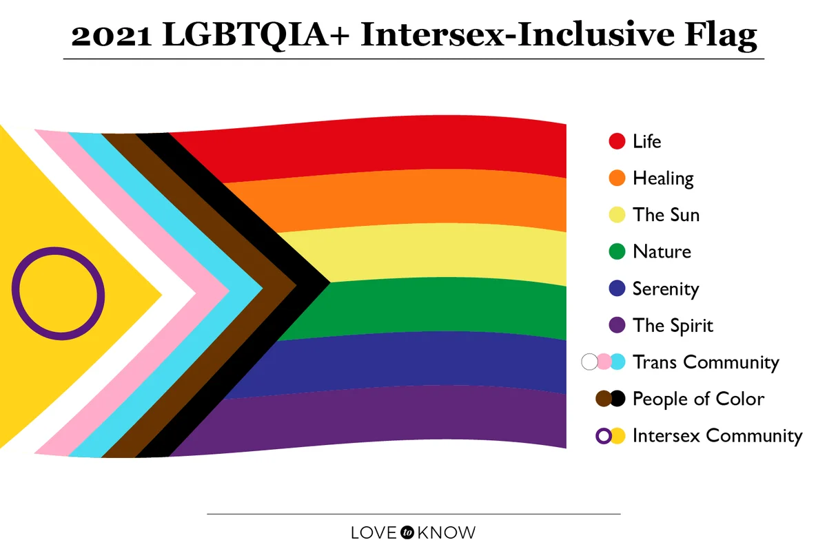
As of 2021, there was a new campaign launched by the Intersex Equality Rights UK advocacy group that adds to the newer Progress Pride flag. A large yellow chevron and a purple outlined-circle added to the 2018 flag was proposed by designer Valentino Vecchietti as a way to be more inclusive of intersex individuals. As this conversation unfolds, it goes to show just how mercurial the LGBTQIA+ flag's design really is, and that it's a blank canvas on which to learn and adapt.
Wave Your Flag With Pride
While it's a beautiful thing to share your sexual and gender identity with the world, a world that's constantly threatening legal, political, and criminal persecution against your identity, the LGBTQIA+ flag is a uniting symbol that can give you a sense of safety and belonging by helping you find your people. While you're waving your LGBTQIA+ flags loud and proud, don't get too attached to any one specific design, because a new one will probably come along to reflect the changing systems of identity, gender, sexuality, and culture. But it will be just as beautiful and sensational as the last few flags have been.