Nature has inspired art for all of time. So, it shouldn't be surprising that many people want to bring the essence and beauty of nature into their homes. Nature-inspired color palettes are not a new trend, nor will they ever go out of style. Color palettes that are crafted with an aspect of the natural world in mind are so sought after because they bring the calm, serene, and inspiring elements of nature into the spaces that impact everyday life in a timeless way.
A natural color palette is not limited to shades of green and brown. In fact, nature gives us every possible color to work with. From the purple of mountain ranges to the vibrant colors of insects and ocean life, nature can inspire color palettes that are vibrantly alive.
Dark Nature Color Palettes
If the dark and mysterious parts of nature draw you in, invite them into your home's design. Dark nature color palettes will contain two or more dark shades accompanied by any other shade of color to complete the palette.
Sunset Shadows
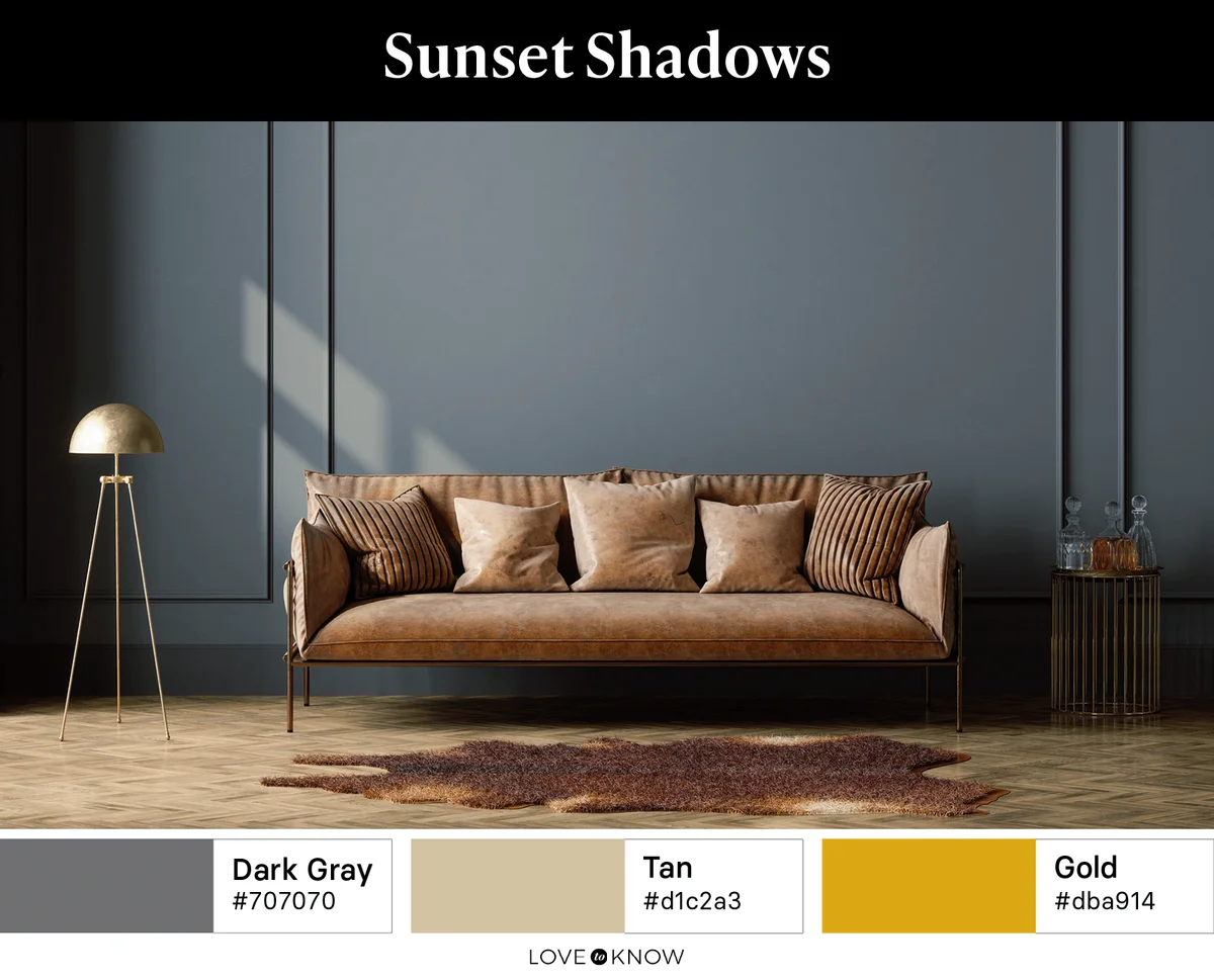
Inspired by the last rays of light casting shadows at day's end, this palette uses the deep purple-gray tones of twilight with just a hint of rich gold from a lingering sunset.
Autumn Forest
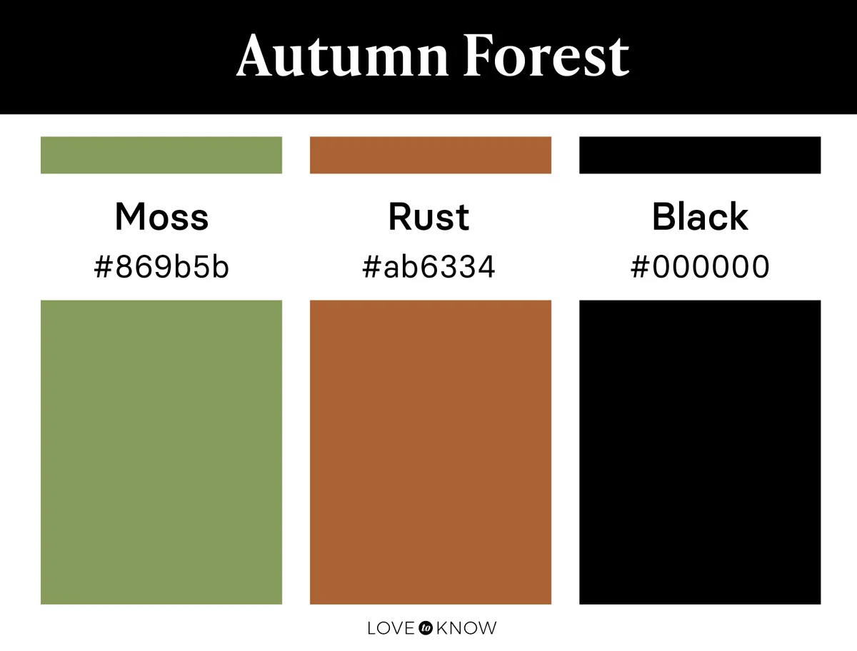
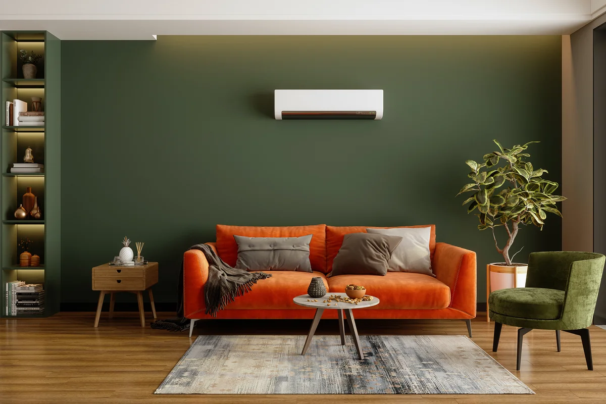
Colors of the forest, where the sun casts little light, create a rich and moody palette for your home. Let a deep, mossy-green be your neutral base and accent with jet black. Touches of warm rust give contrast, much like the changing leaves of autumn.
True Autumn
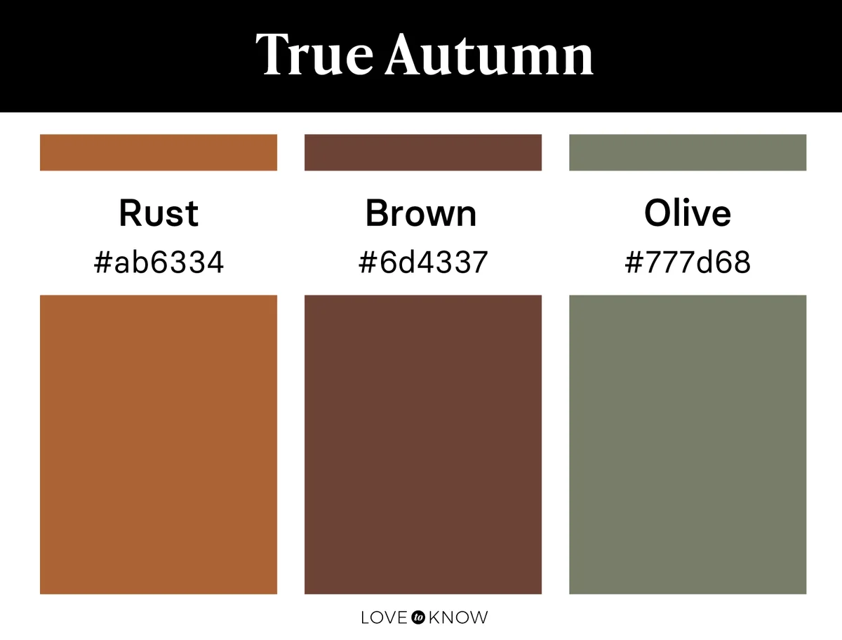
Perhaps you would rather fully embrace the colors of late autumn. If so, choose deep shades of rust, brown, and olive, and use them all as interchangeable neutrals. Be sure each shade has the depth and warmth of fallen leaves, so those autumn qualities you love really shine through.
Dark Night
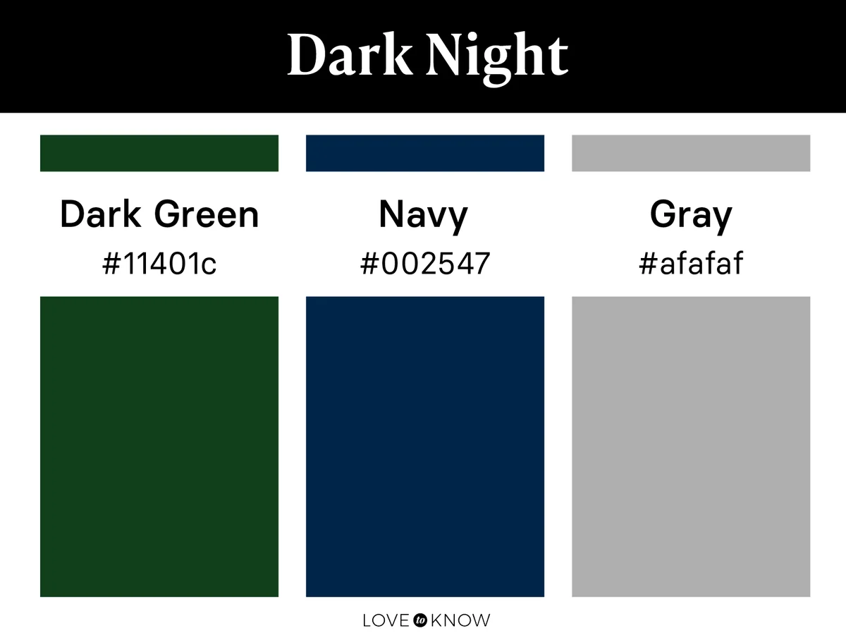
As night begins to settle on nature, notice the common colors you see. Bring those colors to your decor. Add variation to a dark gray primary palette color by accenting in dark green and rich navy.
Moody Nature
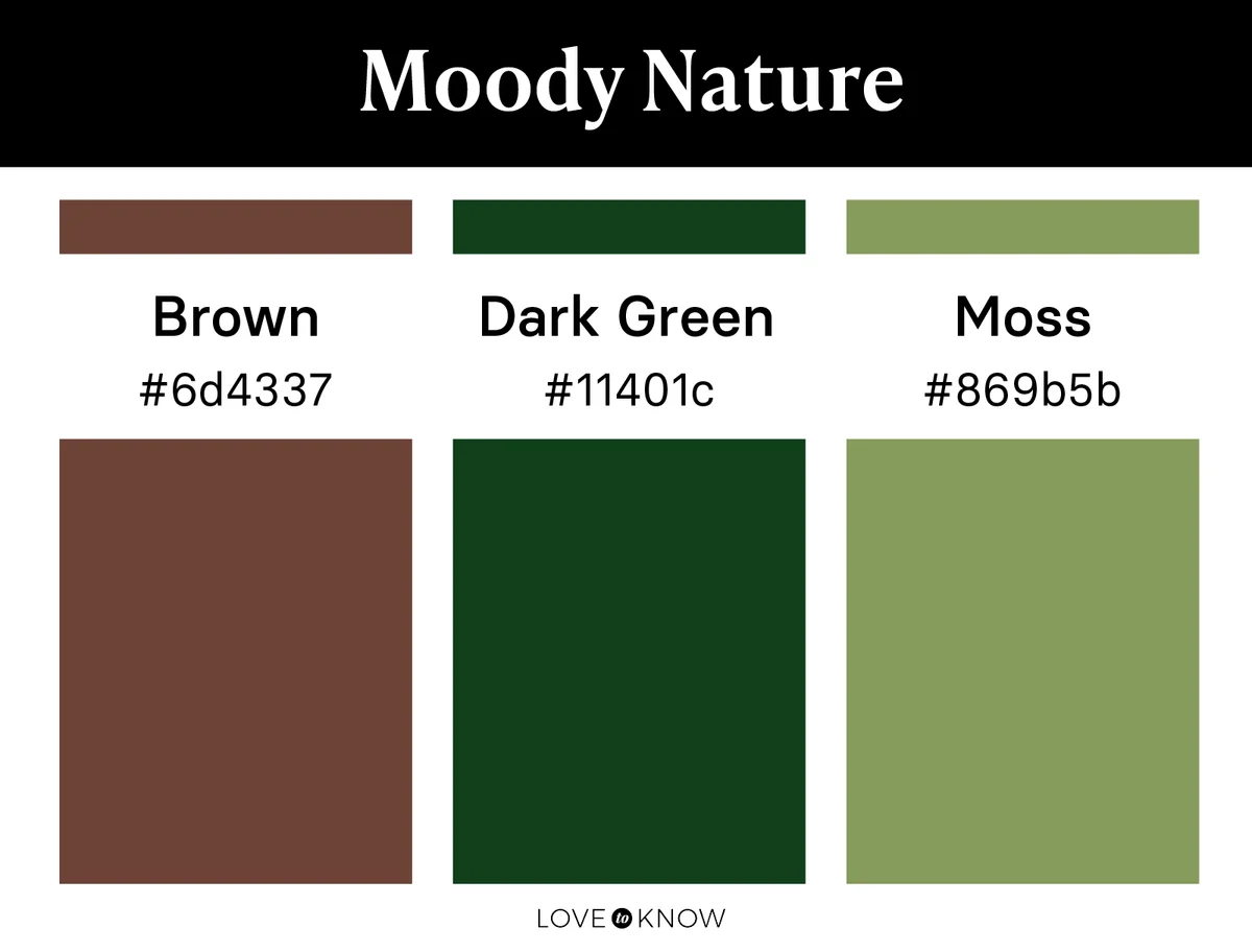
Brown and green are colors we see often in nature, so they translate easily to nature-inspired palettes. Add a moody twist by drawing inspiration from those darker shades of nature's favorite colors. Accent deep chocolate brown with dark green and a hint of bright moss to bring a little life into the space.
Autumn Mums
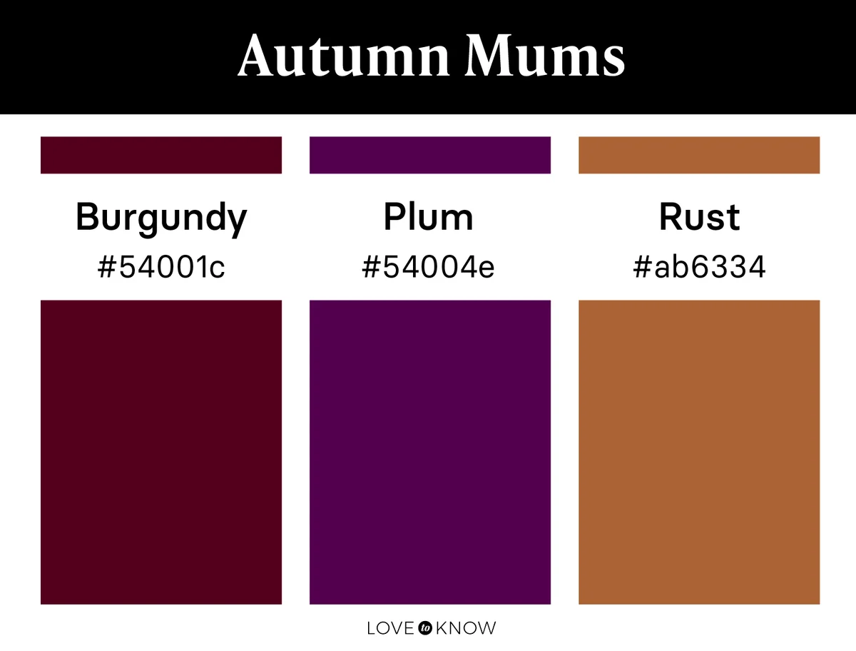
Nature gives us the beauty of deep, rich-colored flowers like mums in autumn, and these are a beautiful source of inspiration for a dark color palette. Pull together a palette with a dark tone of plum, a rusty orange, and a rich burgundy to create a warm and cozy space inspired by nature.
Light Nature Color Palettes
If you want your nature-inspired design to feature lighter and softer colors, try creating a palette based around sandy beiges and soft blues or greens. Most color palettes that are light will feature a collection of soft and light tones, though some may contain one darker or brighter color to act as an accent.
Early Spring
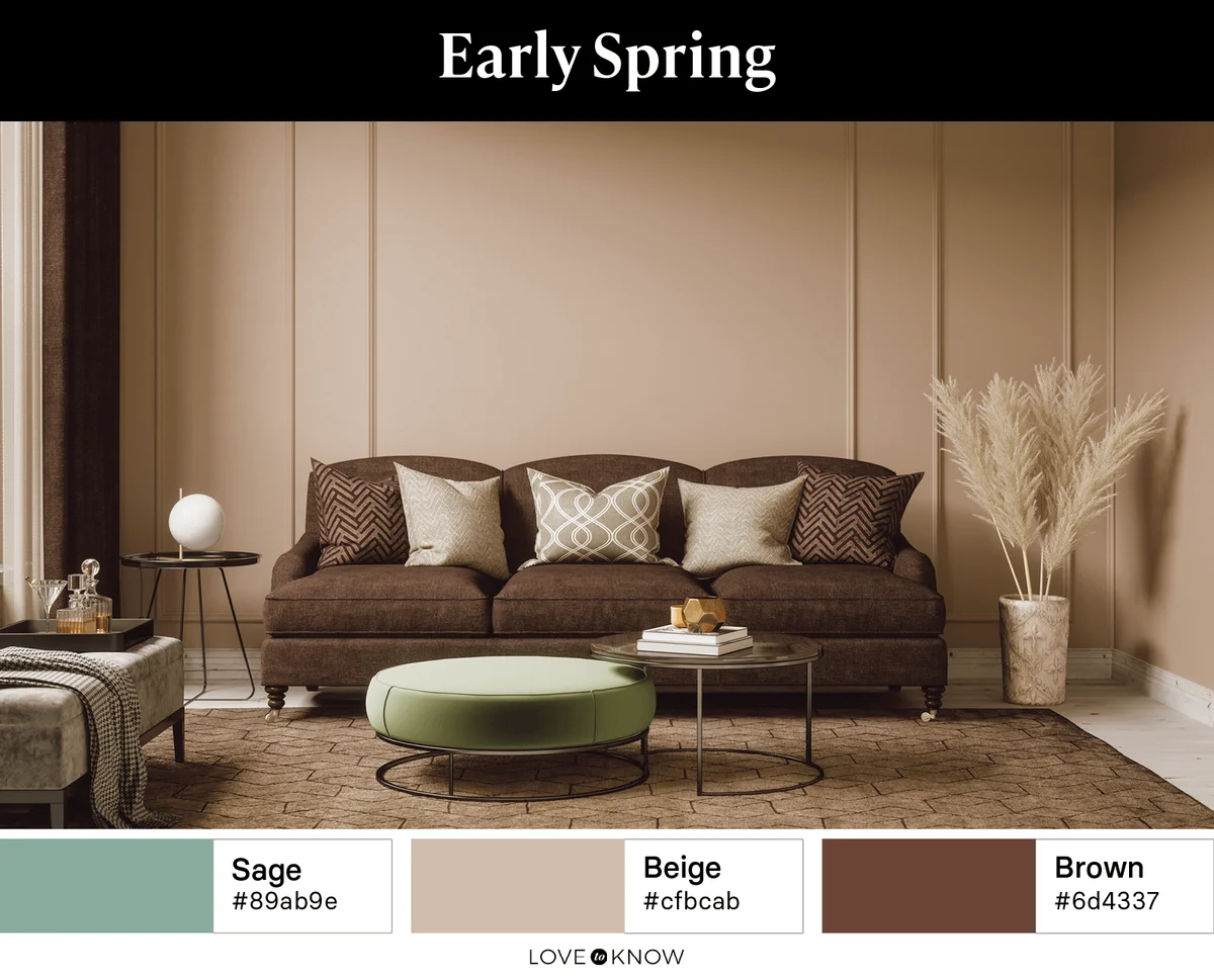
This is a warm and light palette, much like the beginning days of spring when new life in nature is starting to emerge. Sage and beige both act as grounding neutrals, so you are able to use them interchangeably. Add brown wood-tones that give nod to the awakening trees of spring.
Rainy Day
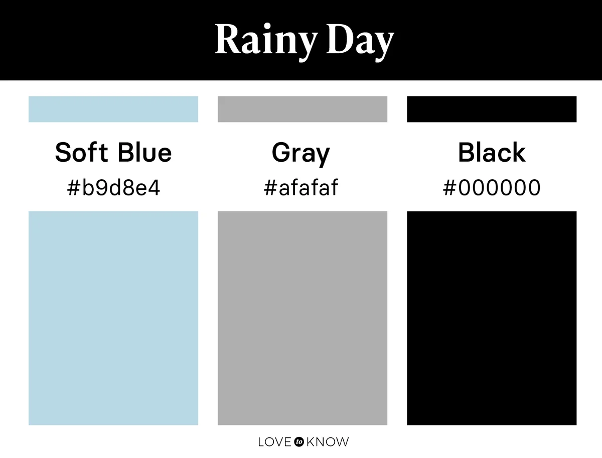
The cozy feel of a cold and rainy day might be the exact feeling you want your study or family room to have. Bring those vibes inside with a soft blue, a true gray, and an accent of black. It's still light in color, so it feels clean and fresh, but those subtle shades of blue and gray will give you all the coziness you love about a rainy day.
Coastal Warmth
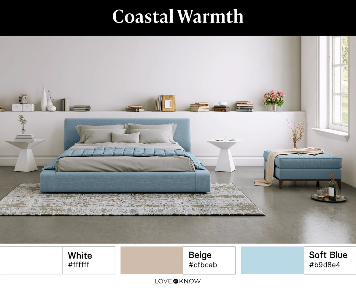
If you love the shades of soft blue in nature but prefer more warmth, your source of inspiration might be the coast. Like the tides against the sandy shore, the combination of bright white, soft blue, and sandy beige might be the relaxing warmth you long for. For this color palette, make sure the beige is your darkest color (though it is still light). Doing so will keep the space warm and bright, just like the beach.
Fading Winter
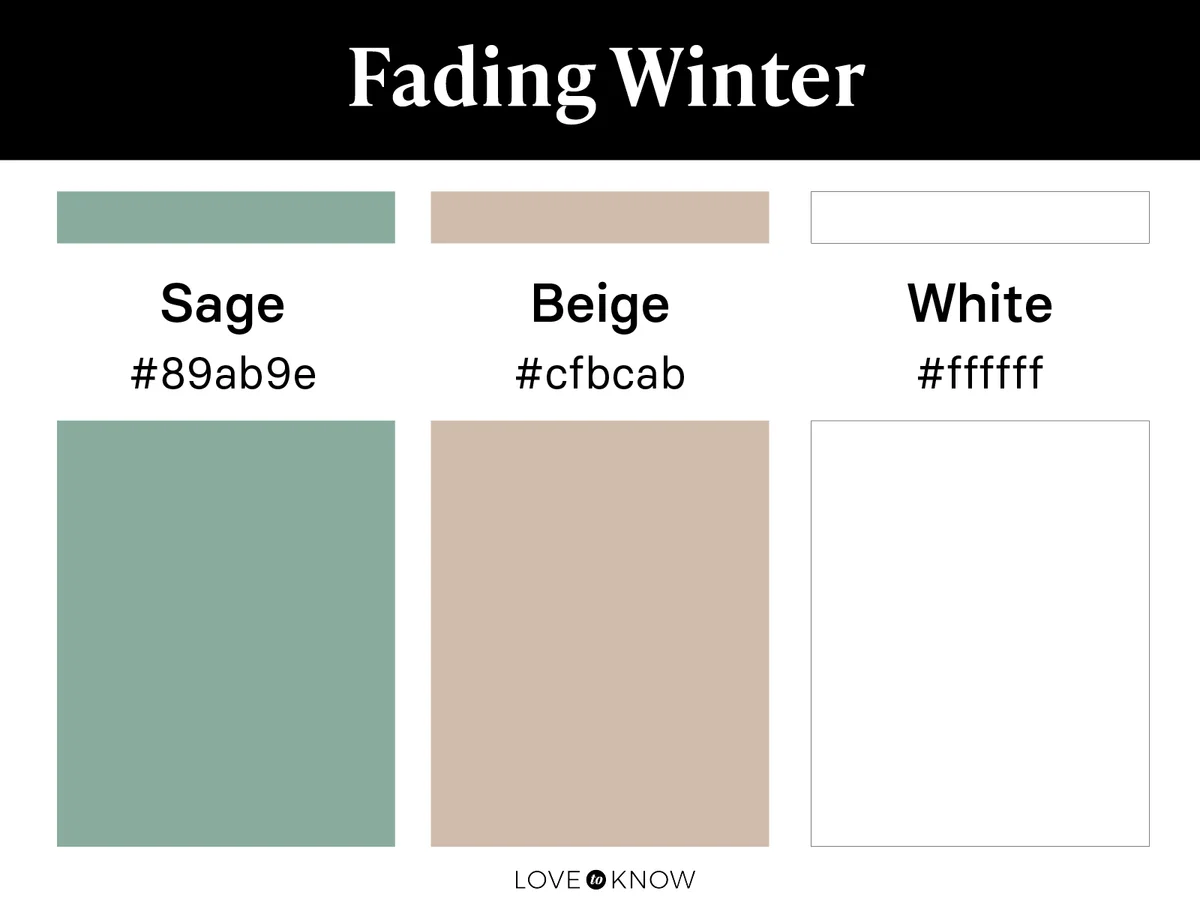
Picture pine needles and crunchy leaves peeking through a blanket of melting snow. This color palette has all the elements of a fading winter scene. Use a snowy white alongside a subtle sage and a light shade of warm beige to achieve this elegant and classic color palette.
Neutral Nature
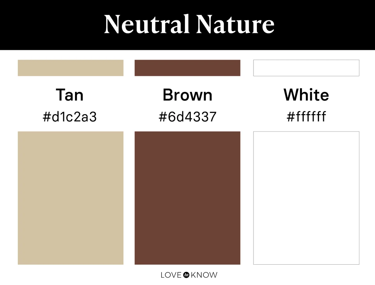
Think of seashells, stones, or other nature elements that feature all of your favorite neutral colors. Use plenty of wood tones or textured elements alongside a palette of tan and white with touches of brown. This palette is generally light in tone, but because it is completely neutral, you can have fun with adding varying shades of those same colors to achieve the contrast and depth you are looking for.
Afternoon Shadows
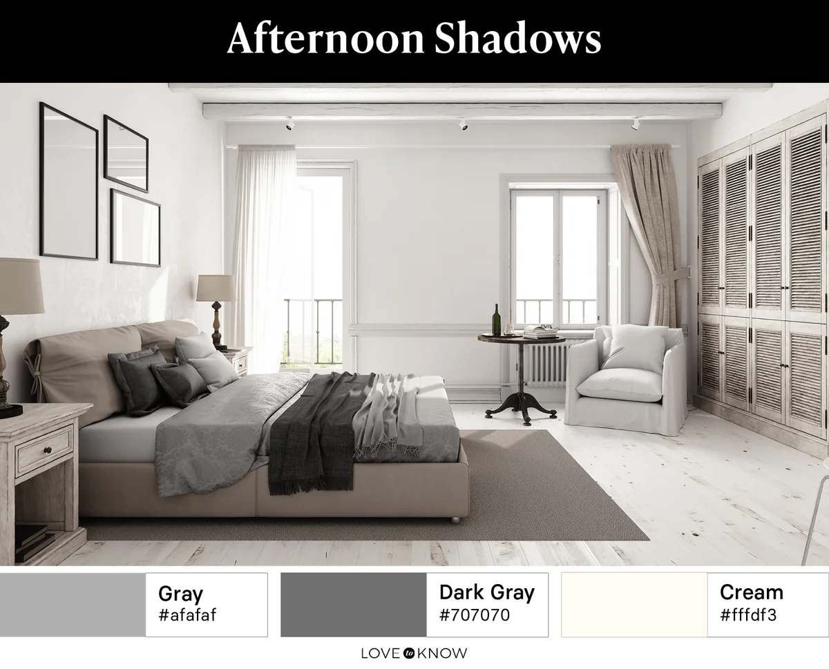
Inspired by the afternoon shadows of a beautiful winter day, this color palette is another great option for rooms in need of light neutrals. There may not be much color or life in this palette, but the combination of warm and cool neutral tones gives it great versatility. Bring in cool grays in a light and a dark tone to stand out in a room that is primarily cream or light beige.
Snowy Dawn
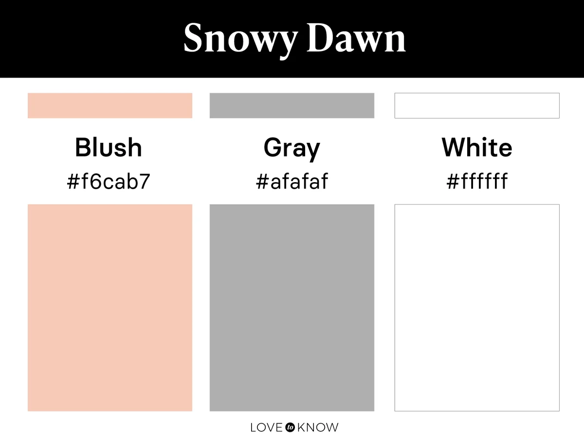
Fully embrace the clear beauty of winter with this snow-at-dawn-inspired palette. Neutral tones of bright white and gray are accented with blush to be reminiscent of a freshly fallen snow during a cold winter sunrise.
Bright Nature Color Palettes
Nature gives us more to work with than just neutral tones. In fact, the most vibrant and bright colors we know can be seen in the petals of flowers, the depths of the ocean, or the glow of the setting sun. Use these bright colors in any amount to create a bright nature-inspired color palette.
Flowering Cactus
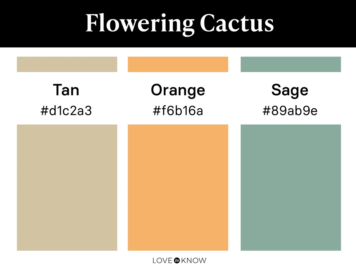
Warm and full of light, this color palette is reminiscent of a flowering desert cactus. Let tan be your neutral color in this palette as bright orange and sage take the spotlight as secondary colors.
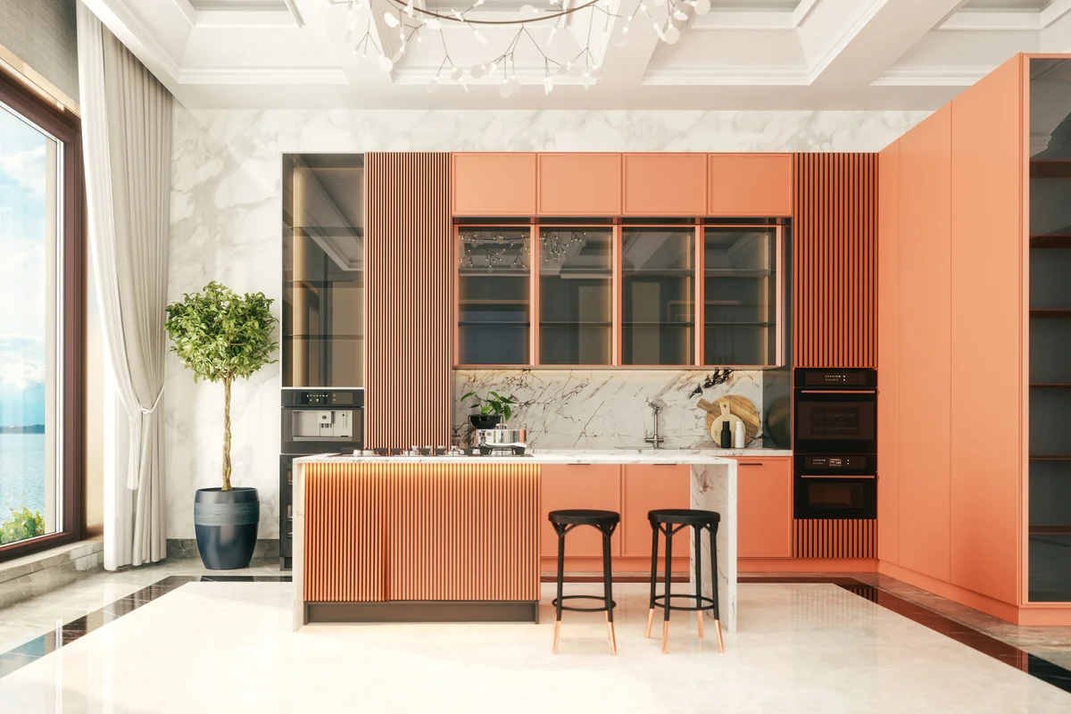
Ocean Dive
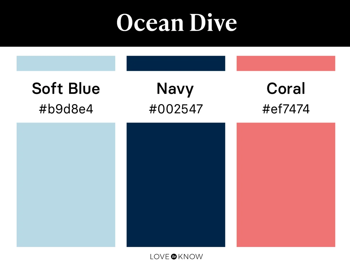
Dive deep into the shocking colors of the ocean with this color palette. Though navy and a soft blue create the largest portions of this nature-inspired color scheme, it is the vibrant and contrasting coral that gives it life. Deep yet vibrant, dominated by cool tones but softened with warm ones, this color palette truly holds all the qualities of the ocean.
Field of Tulips
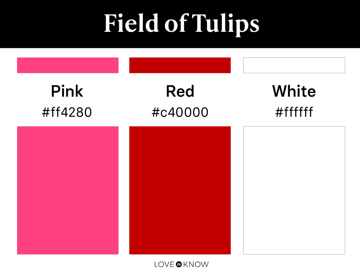
Nature gives us every vivid color imaginable, and a field of tulips is one of the most vibrant examples. Full of bright whites, sweet pinks, and bold reds, this palette gives all the vitality and whimsy of blooming spring tulips. Let white act as your grounding color here, and then add all your warm-toned pinks and poppy reds for punches of color throughout.
Open Skies
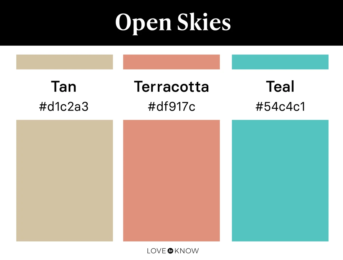
Open skies over desert plains are warm and bright, just like this color palette. Opt for a warmer blue - like this rich teal - to complement the tones in your neutral tan and warm terracotta.
Florals & Foliage
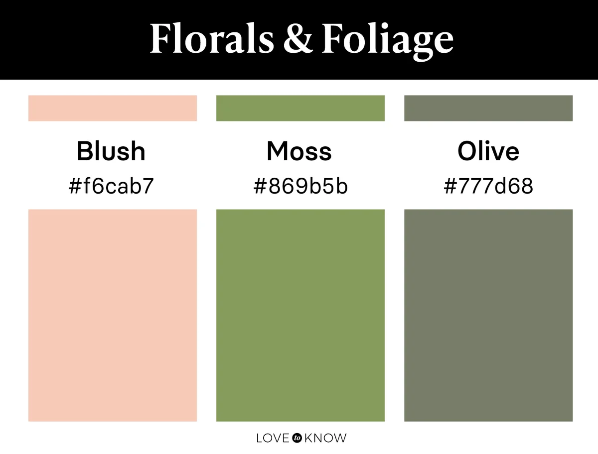
The combination of florals and foliage is one of nature's most colorful displays, so it makes sense to draw palette inspiration from it. This color palette embraces the softer pink of florals with the rich and bright greenery often seen alongside it. Olive green is your primary color, with moss green and soft blush making their appearance as secondary shades.
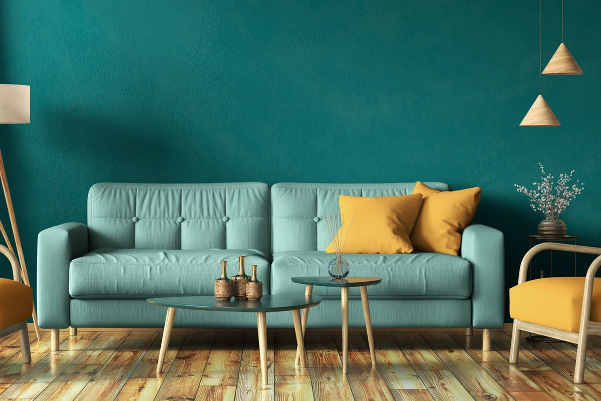
Butterfly Wings
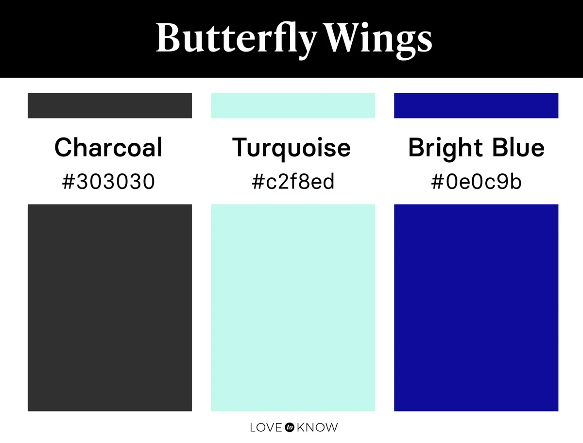
Florals aren't the only thing nature gives us with abundant vibrancy. Insects, birds, and ocean life all offer endless sources for color inspiration. Create a beautiful color palette from the blue and black wings of a butterfly with the rich turquoise found on the scales of a tropical fish. Let charcoal be your neutral base so the bright blue and rich turquoise stand out in your room.
Classic Sunset
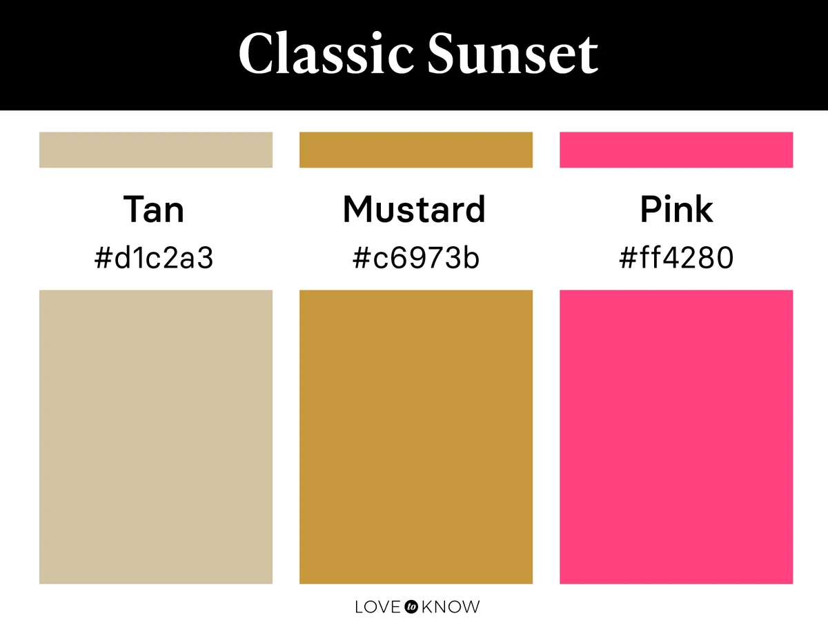
A list of bright nature-inspired color schemes wouldn't be complete without a sunset palette. Sunset color palettes are a beautiful way to bring warmth and liveliness to your room. Choose tan and mustard yellow as interchangeable base colors, acting as neutrals. Complement their warmth with a warm pink so the sunset idea is clearly conveyed.
Mountain Sunrise
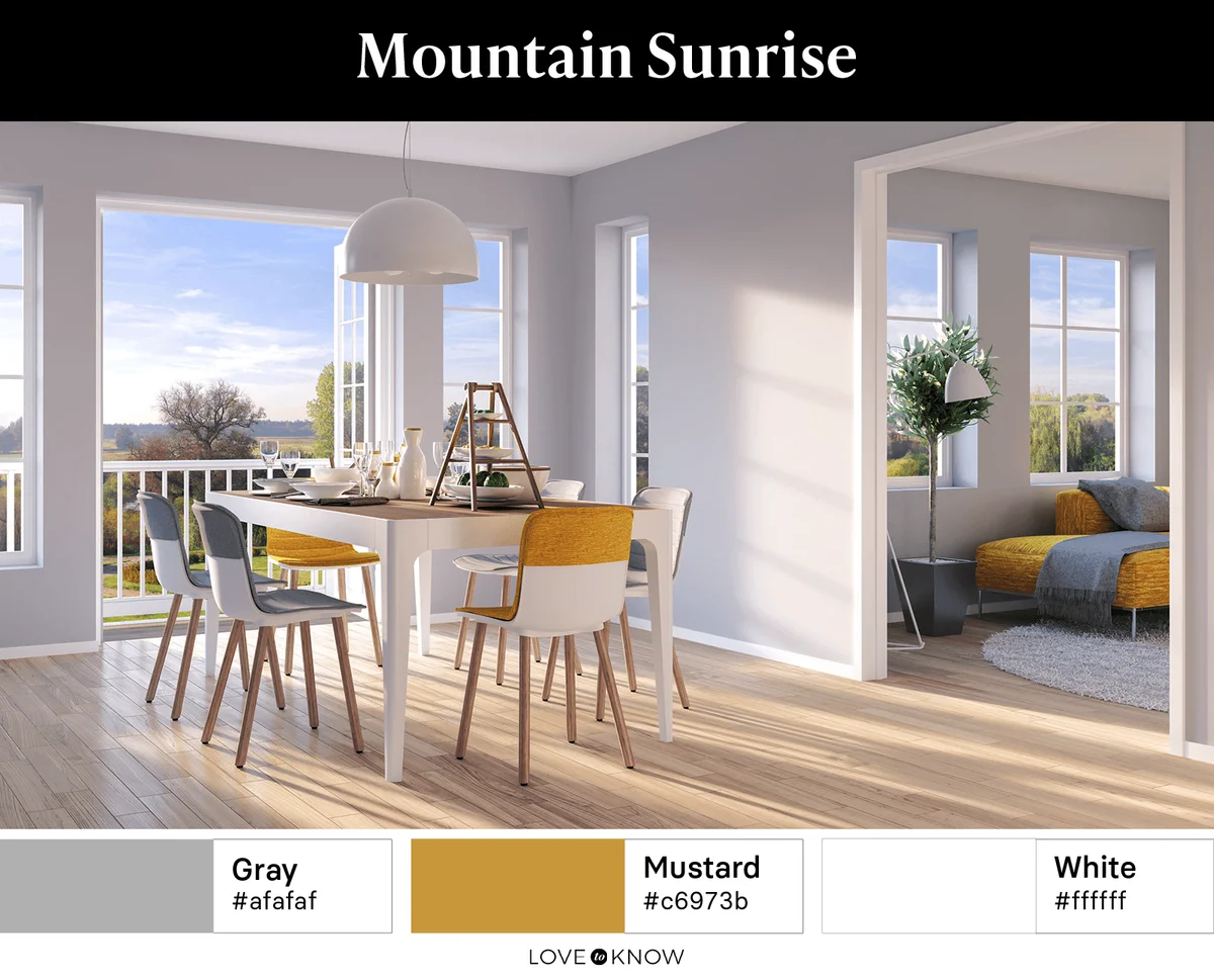
Love the yellow look but want something more neutral? Think of sun rays on a rocky mountainside. Light gray and white become the base of the color palette so those bright mustard yellow accents can take center stage.
Muted Nature Color Palettes
Nature gives us so many inspiring bright colors, but it also provides us with muted shades of nearly every color. Muted colors may appear muddy or grayish in comparison to their bright counterparts. They make for beautiful palettes that incorporate plenty of color without feeling too intense.
Sea Shore
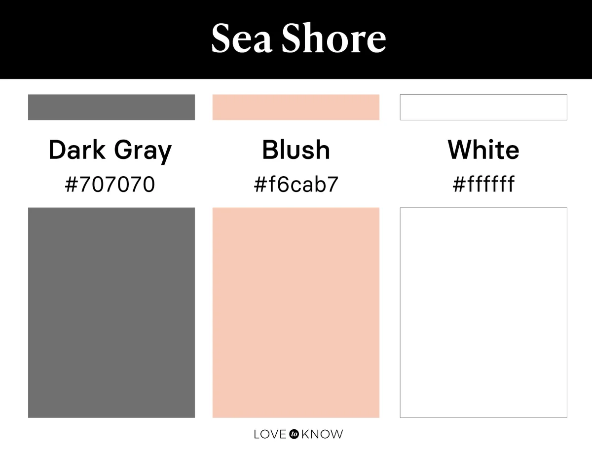
Drawing inspiration from soft-toned seashells along the shore, this color palette has both depth and light. Choose a dark gray that feels cool but not too blue and complement it with a basic white and a muted tone of blush.
Winter Mountains
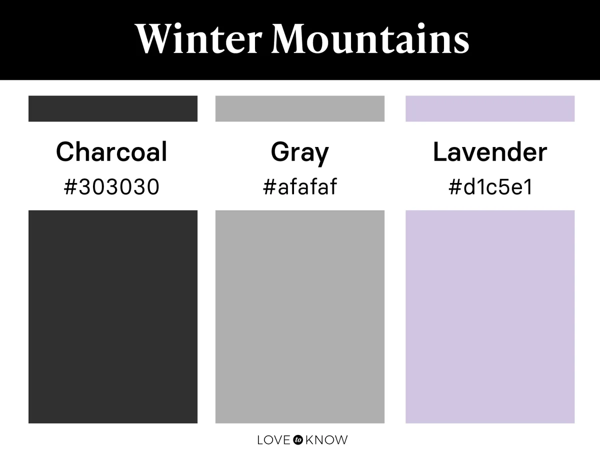
Mountains are a perfect example of beautiful muted colors in nature. Though the shades are ruled by gray, they still command attention. Choose a true, medium gray alongside a deep charcoal and accent with light lavender.
Field of Lavender
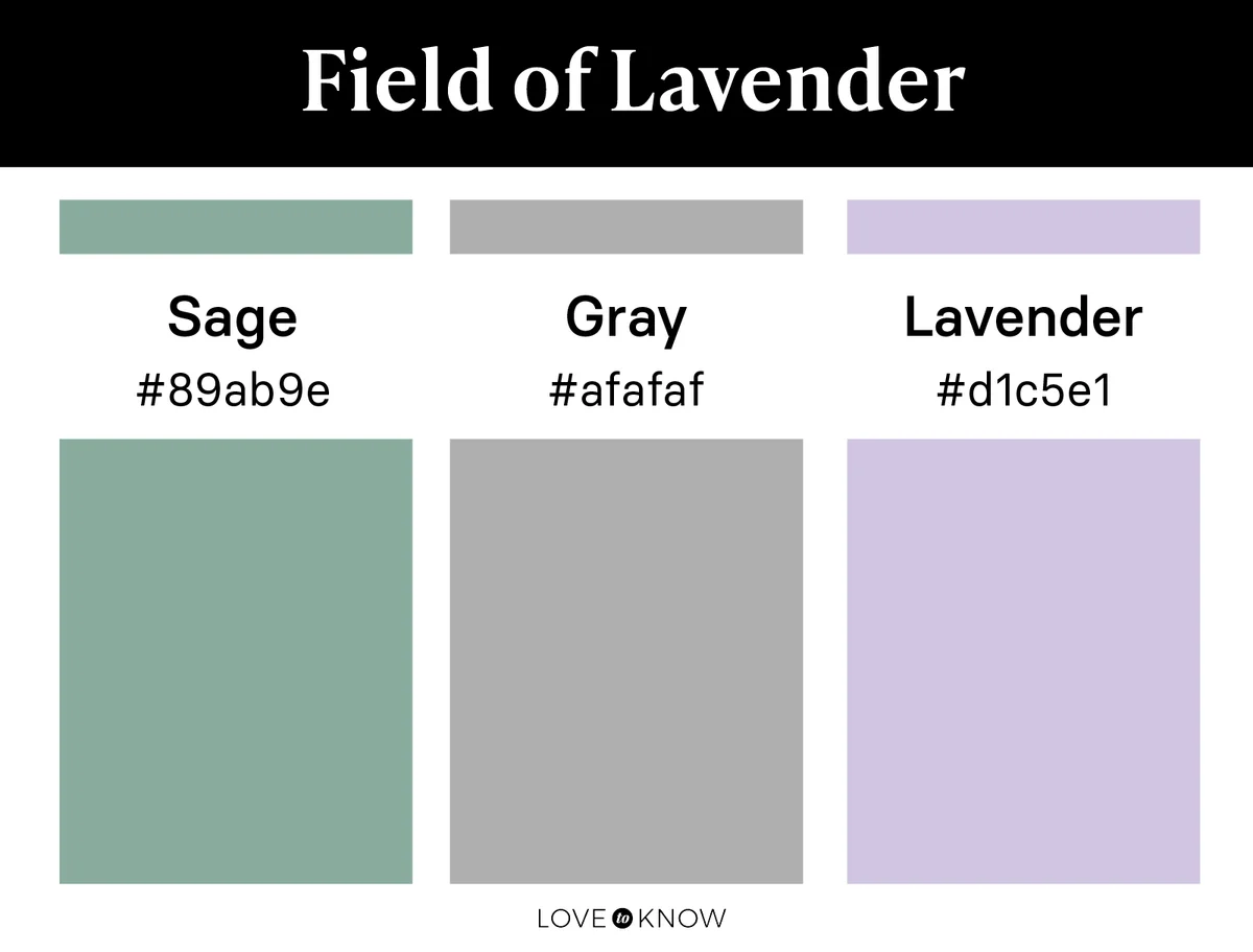
Purple also appears alongside cool, muted greens in a breezy field of lavender. Sage and gray are your base colors here so that soft lavender can stand out as the accent color in the room.
Forest Floor
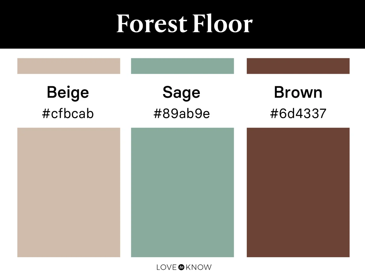
For a warmer nature palette with muted shades, turn to those trusty greens and browns of the forest floor. This time, make them muddy and tinged with a little gray to create the muted look you want. Try beige as your neutral and complement it with a sage green to flatter a deep, muddy brown accent.
Rocky Terrain
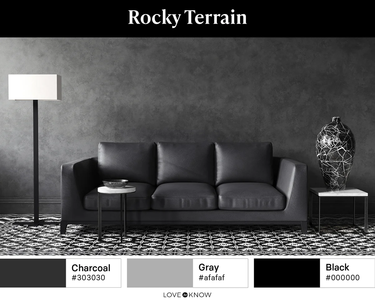
If you want a more neutral color scheme that still contains muted tones of nature, let stones and rocky terrain be your inspiration. Bring in a muddy charcoal, a gray with just enough of a purple hue. Add a touch of black for accent.
Muted Autumn
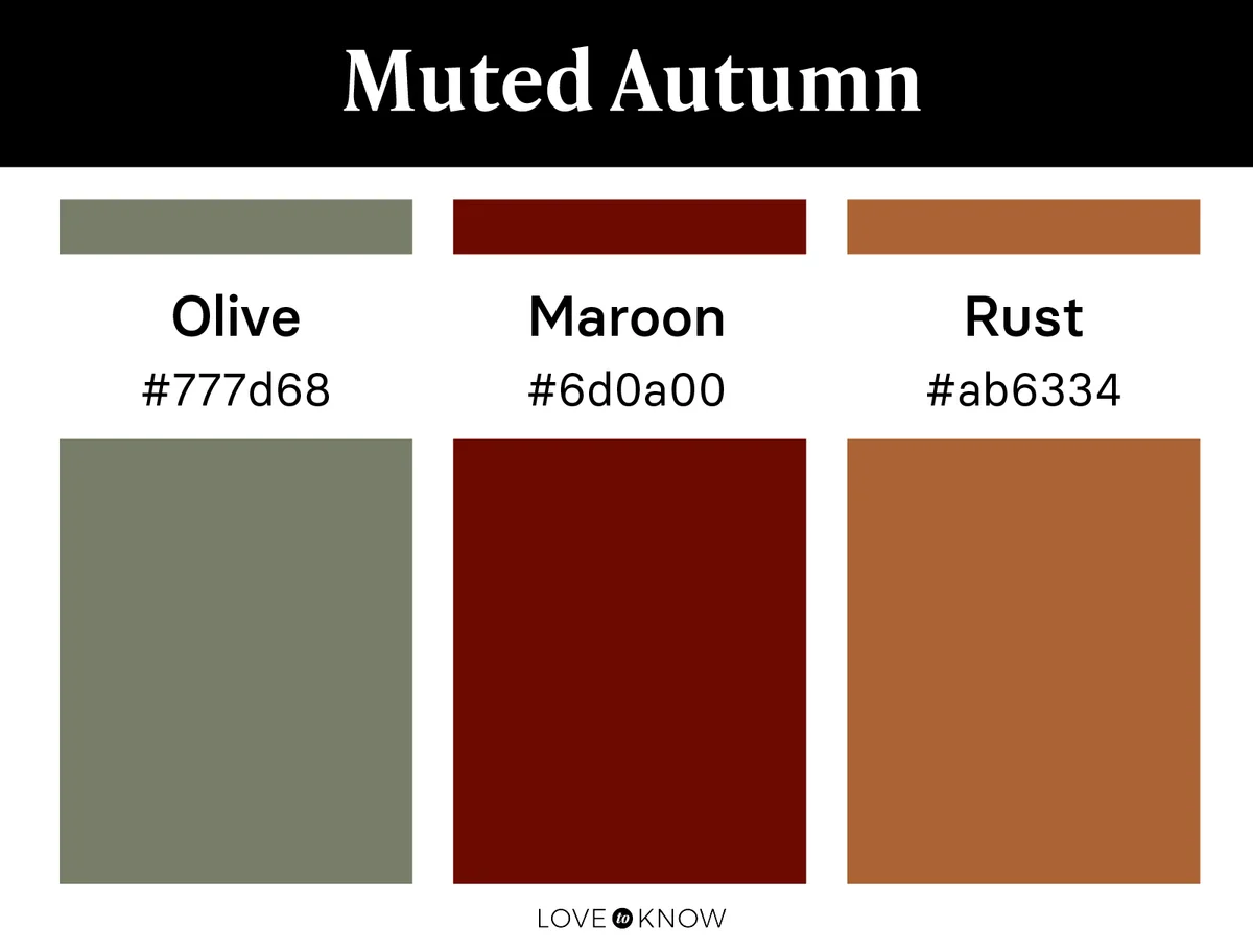
Fully embrace the muted warmth of autumn with this color palette. Olive acts as your primary color, while rust and maroon give warmth and depth to the room as accents.
Ocean Sunset
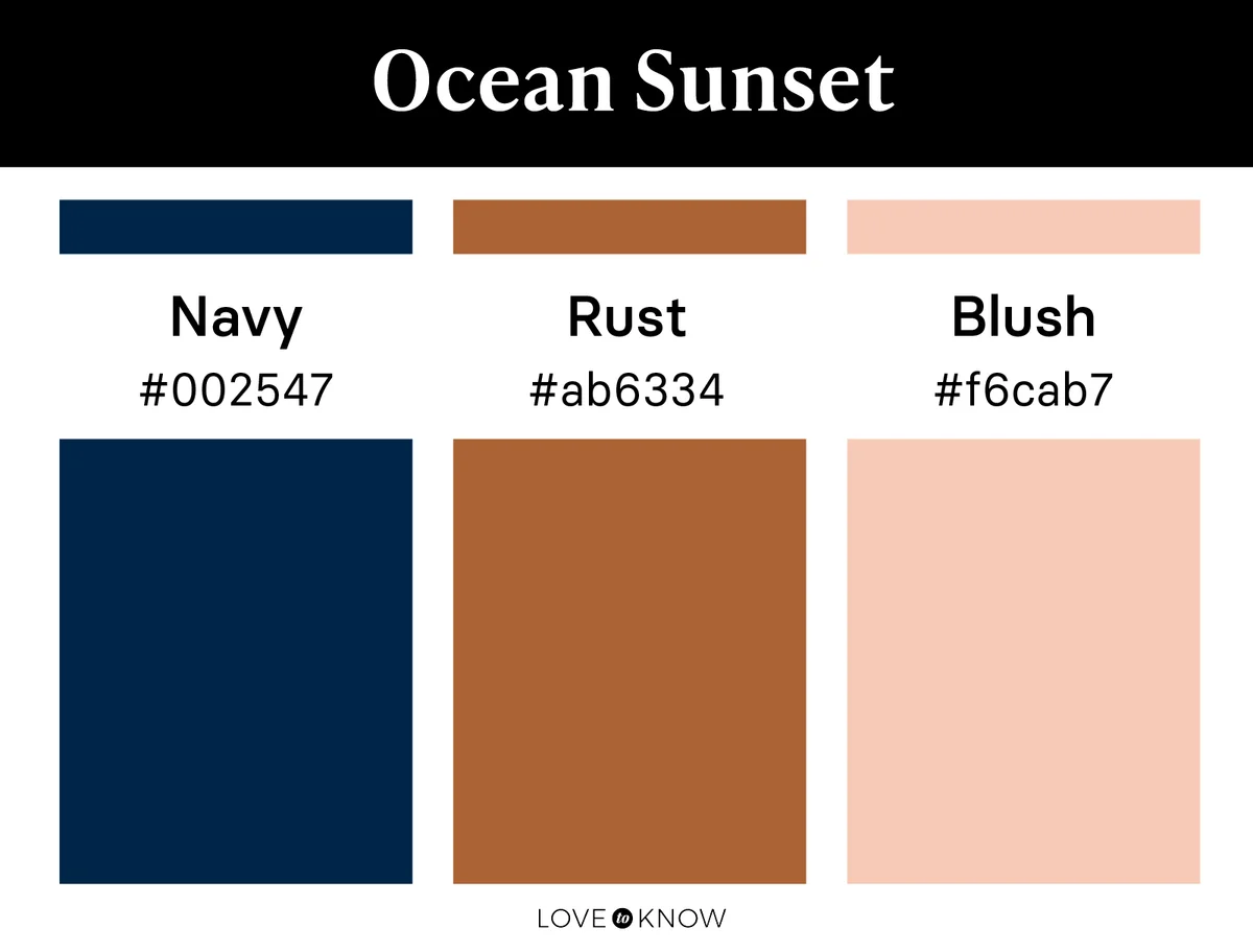
Like the ocean at sunset, this palette feels a bit dark and moody, but it's touched with subtle color. Start with a gray-toned navy and follow it with a muted shade of rust and soft sunset blush.
Creating Nature Color Palettes
As you build a color palette inspired by nature that you love, keep in mind all the elements of nature you're drawn to and how those colors interact with one another. Whether you are drawn to the intensity of dark and bright colors or the subtlety of light and muted colors, be assured that a nature-inspired color palette can be just as unique as it is timeless.