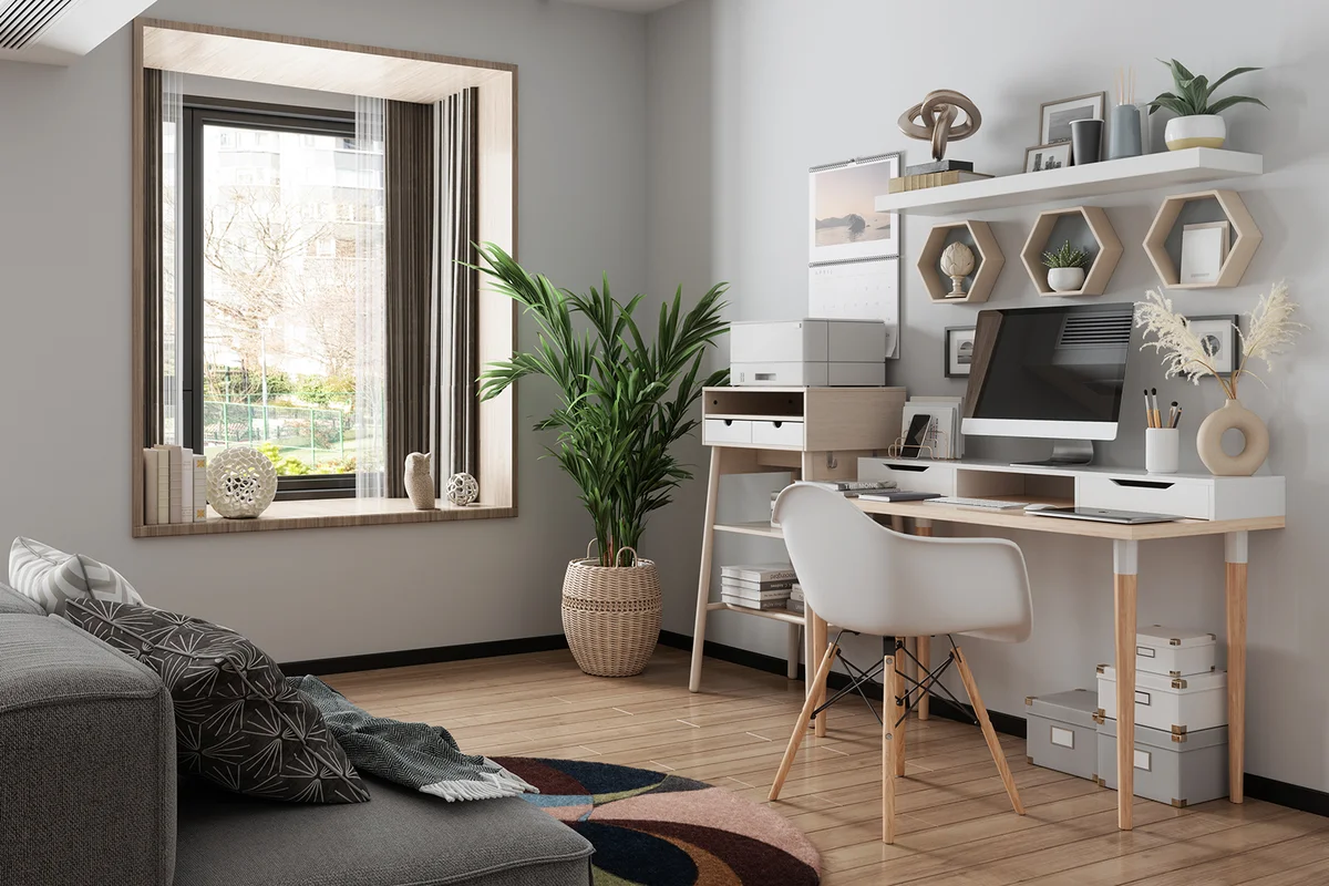
Creating an effective environment for work — whether at home or in an office building — takes more than just tossing up a desk and a few drab grey cubicles and moving staff in. Choosing office wall paint colors that have the desired effect on you and your staff is key to becoming a top-performing workspace. One of these colors could just make your workspace an ideal working environment.
Blue Boosts Productivity
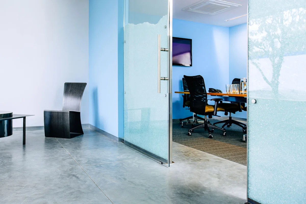
Want to boost productivity? Blue is the way to go. This calming, soothing color can keep everyone focused on the task with minimal interruption, and it helps keep everyone from getting stressed out. So, if you need everyone to be focused and productive, choose a soft blue color.
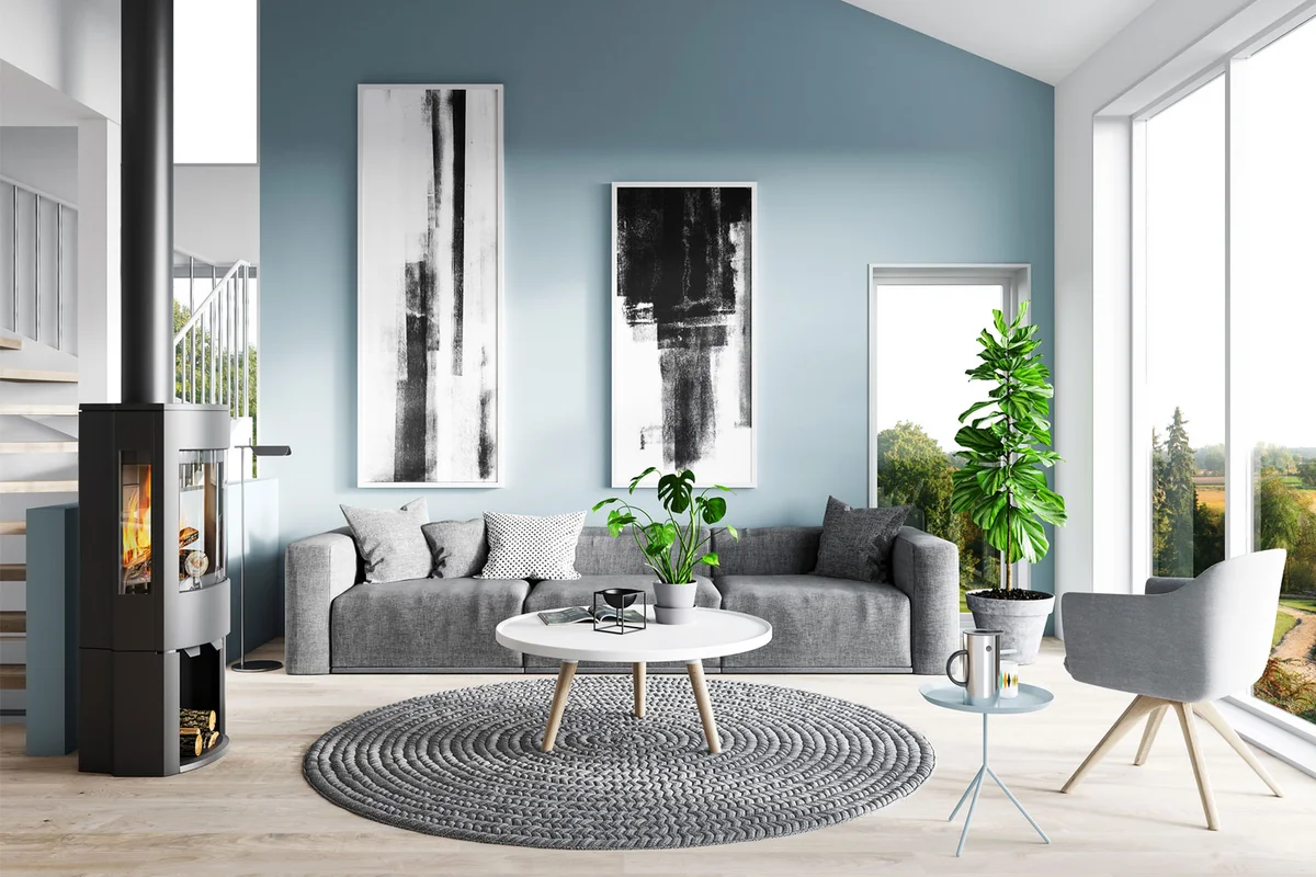
Blue-Gray Creates Calm
Blue-grey is a popular paint color for bedrooms because of its soothing properties, and it can help calm chaos in an office environment, too. This is the ideal color for high-stress workplaces to keep workplace chaos to a minimum.
Chartreuse Invigorates
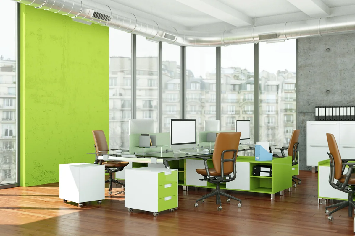
If you need your workers to be peppy, excited, and energized, a bright green like chartreuse invigorates. It's a great color for office spaces where creative, out-of-the-box thinking is required — like marketing and graphic design departments.
Mustard Yellow Invites Optimism
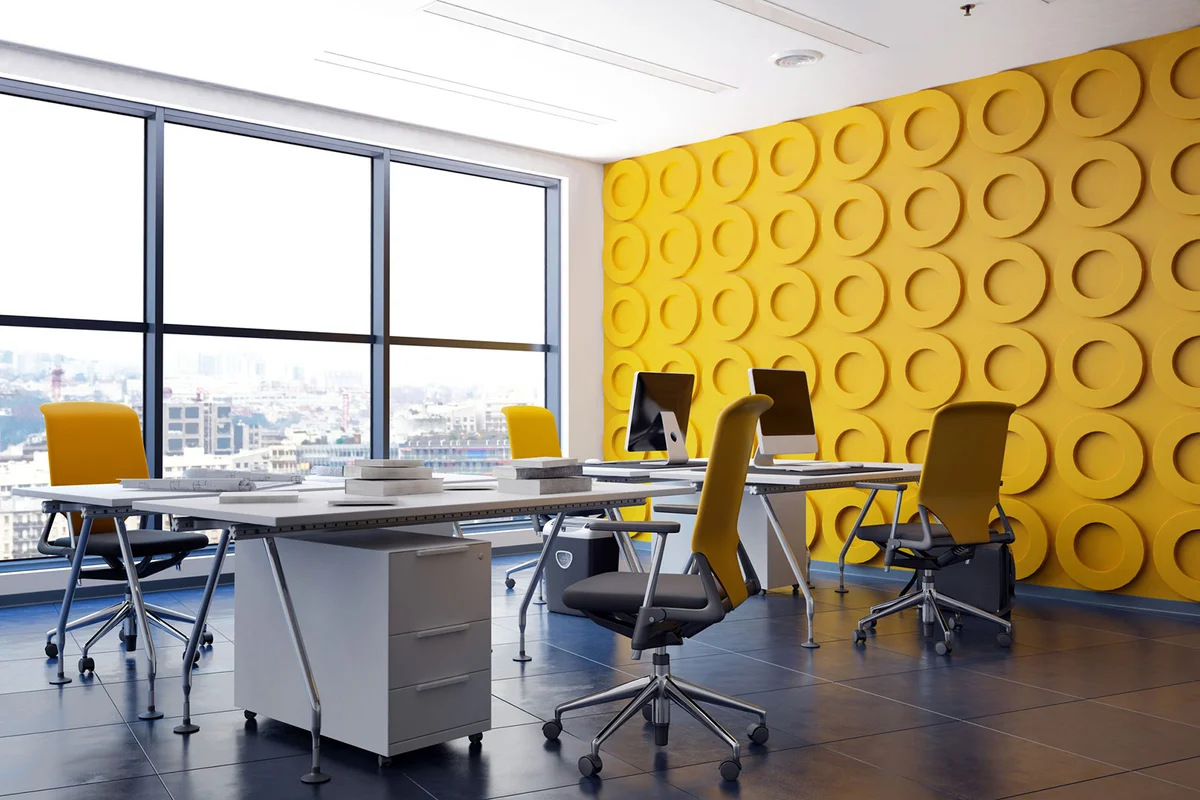
Too much or too bright of a yellow can be overstimulating in an office environment, resulting in lack of focus and stress. But a mustard yellow color invites feelings of optimism without the overstimulation. Stick to an accent wall versus every wall to get the most out of this color.
Dark Grey Encourages Problem Solving
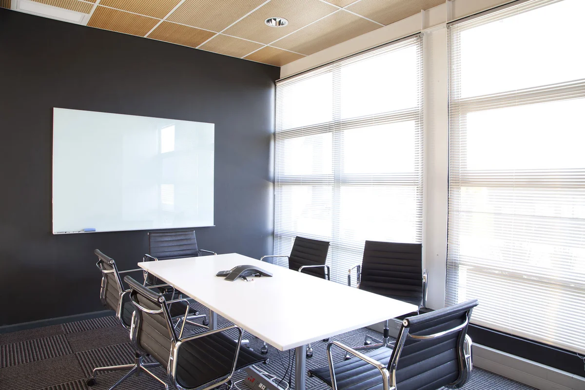
The psychological impact of dark gray induces and supports problem-solving abilities. It's great for a conference room or a shared brainstorming workspace. Use this color sparingly, such as an accent wall, to prevent the office from becoming gloomy and depressing.
Industrial Grey Reflects Conformity
Is your workplace one where you need high levels of employee conformity or need a color that helps people stick to and enforce rules? Industrial grey is for you. It's not distracting to employees and helps them stay focused on the important tasks requiring a high level of compliance.
Gold Invites Wealth
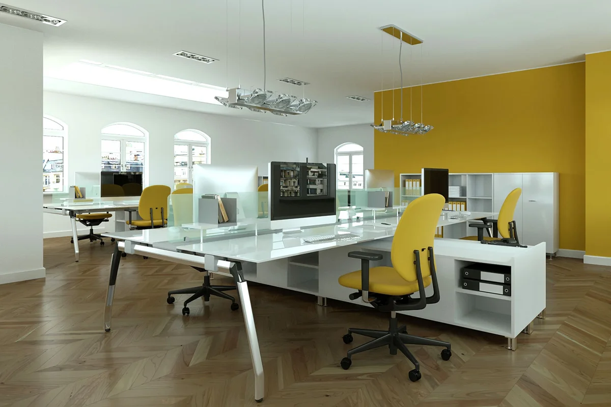
Since money is the heartbeat of most offices, painting an accent wall gold can reinforce the theme of making money and inviting wealth. Stick with a single wall for this color, perhaps in the accounting area or near where sales take place.
Green Stimulates Creativity
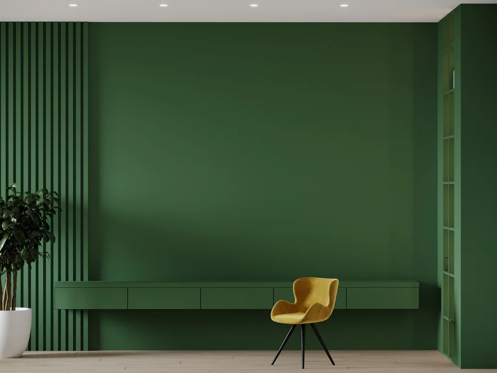
A lot of offices require creative thinking, and green is a color that stimulates creativity. Use a darker green on a single wall, or paint walls a light sage to provide a calm yet creative space.
Keep Everyone Engaged

Paint color can create a more pleasant, less stressful office for everyone who works there — whether it's a home office or a business office. So if you're looking for increased productivity, creativity, and focus, one of these office colors could make a major difference.