Homepage Content

New & Popular Topics
Top Reads
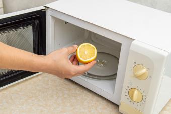
We Tried These Tik-Tok Famous Cleaning Hacks
Cleaning

All the Pancake Ideas You'll Ever Need for the Best Breakfast
Recipes

Blurt Alert! These Awkward Moments Live On in Our Heads
Lifestyle

When to Grill Shrimp With the Shells On (& When Not To)
Recipes

Ace the Transition With This Back-to-School Checklist
Kids

6 Tips for Getting Kids to Pose for Back-to-School Pictures
Kids


Try These Creative Sidewalk Chalk Ideas on the Next Nice Day
/
Kids
Ace the Transition With This Back-to-School Checklist
/
Kids

19 First Day of School Picture Ideas for All Ages
/
Kids

16 Fun Things to Do on the Last Day of Summer Vacation
/
Kids

9 Old Things You Inherit That Could Actually Be Worth Money
/
Antiques & Collectibles

Pretty August Birth Flowers: Gladiolus and Poppy
/
Garden

12 Surprisingly Dangerous Things You Can (But Shouldn't) Thrift
/
Antiques & Collectibles
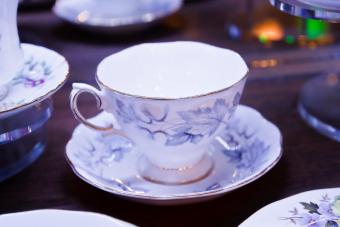
Get the Tea on Antique Teacups: Value, Styles, & More
/
Antiques & Collectibles


Disco Party Ideas That Are Off the Hook
/
Parties

32 Back-to-School Bash Ideas for an Awesome Event
/
Kids

Fun & Memorable Family Labor Day Activities
/
Special Occasions

Name Your Summer Party: 100+ Sizzling Event Names
/
Parties


